
The Meaning of Color: A Documented History of Pigment, and an Unsettled Science of Naming
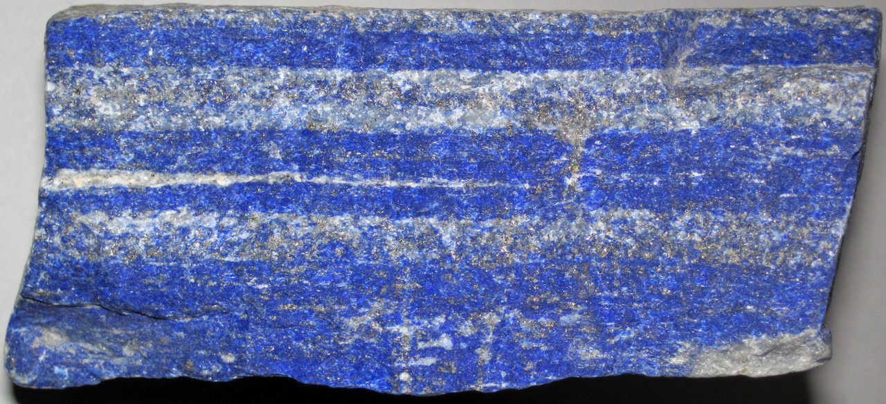
Color has a documented history and a contested science, and this page keeps the two apart. On the record: an ochre-processing workshop at Blombos Cave dated to about 100,000 years ago, one valley in northeastern Afghanistan supplying the ancient world with lapis, a purple wrung out of a gland in a sea snail whose dyed silk Rome's own schedule of maximum prices set far above the same weight of gold, and a blue pulled out of a furnace in Oregon in 2009. Not on the record: any multiple for those prices, which circulates in incompatible forms and is therefore not printed here. Contested: whether every language names colors in the same order, which Berlin and Kay proposed in 1969 and which is still argued about. Refused outright: that Homer's Greeks could not see blue, that the Himba cannot find a blue square among greens, and that red makes you hungry. This page carries the dispute unresolved, corrects in the open the errors it found in our own research file, and rests no claim on how a color looks in a web image.
For most of recorded history, if you wanted the blue in an altarpiece you had to go to one valley in the Hindu Kush. Lapis lazuli came out of Sar-e-Sang and its neighboring workings in Badakhshan, in what is now northeastern Afghanistan, and from there the stone traveled west into Mesopotamia and Egypt and east into the Indus valley, thousands of kilometers from the only mine that produced it. Ground and purified, it becomes ultramarine, a name that means nothing more romantic than from beyond the sea. For most of the human past color was something you dug up, fired, ground or killed for, and it had a price.
That half of the subject is solid ground, and it is the better half of this article. The other half is not solid at all. What colors a language names, whether every language names them in the same order, and how much a name changes what a speaker can do with the thing named, are all live questions, and the versions of them that circulate most confidently are the ones with the least behind them. Some of those confident versions are simply false, and this page says so with the evidence attached.
One rule first, because it binds every sentence below and every picture this page will ever carry. A photograph of a pigment is not a colorimetric record. What reaches a reader's eye has passed through a camera's sensor and white balance, a photographer's processing, a file's color profile, the reader's own screen and its calibration, and the light in the reader's room, and every one of those stages moves the color. So this article will tell you what a pigment is, where it came from, what it cost and what it meant. It will not ask you to judge a hue from an image on a web page, and it rests no claim on how a color looks in one.
And a correction is owed before anything else, to our own research library. File U_2_01 closes with a boilerplate note stating that no significant counter-arguments exist in the scholarly literature for the claims it makes, and that the subject represents established knowledge with no active scholarly dispute. That is false. The same document's own body contradicts it four paragraphs earlier, where it names two research groups on opposite sides of the color-terms question and closes with the words: Debate continues. The dispute is real, it has run for decades in linguistic anthropology, and it is carried open on this page. Other corrections to the same file are made where they arise, each in its own section. The second file this page draws on, U_2_19, is read only for its nineteenth-century color science. Impressionism as a movement is that file's subject and is not this article's.
01What Color Is Before It Is A Word
Color is a physical phenomenon and a biological one before it is a cultural one. Ordinary human color vision rests on three classes of cone photoreceptor, conventionally labeled S, M and L for their short, medium and long wavelength sensitivities, and the genes encoding the three cone pigments were identified and sequenced in 1986 by Jeremy Nathans, Darcy Thomas and David Hogness. One consequence of that architecture matters more than any other here, and it has a name: metamerism. Two lights or surfaces with completely different spectral compositions can produce identical color percepts, because the eye reduces the whole incoming spectrum to three cone responses before anything else happens. Color is not a property of light that the eye reads off. It is a three-number summary the eye computes and the brain interprets.
Two more mechanisms follow from that, and both are ordinary enough to check without equipment. Rod cells give monochromatic vision in low light and cones need brighter conditions, which is why color drains out of the world at dusk. And the brain compensates for the illumination it is working under: a sheet of paper is judged white under a tungsten bulb and under noon sunlight, although the light physically reaching the eye from it is very different in the two cases. That compensation is called color constancy. It is the reason the world looks stable, and it is doing far more work than it usually gets credit for.
The clearest modern demonstration that color is a computation rather than a reading is the photograph of a dress that went viral in February 2015. Rosa Lafer-Sousa, Katherine Hermann and Bevil Conway surveyed 1,401 respondents and found the population split three ways: most saw white and gold, many saw blue and black, and a smaller group saw blue and brown, with individual reports stable over time. Their account is that the image is ambiguous about its own illumination, so observers unconsciously discount either a bluish or a yellowish light source and arrive at different answers from identical pixels. It is color constancy caught in the act of disagreeing with itself across observers. The photograph is copyrighted and is not reproduced here, which costs the reader nothing, because the finding is about what happens inside the observer rather than about anything visible in the file.
Variation between people goes further than that, although not nearly as far as the popular version has it. Tetrachromacy, a fourth functional cone class, is common in birds and reptiles and rare in humans. Women carrying an anomalous long-wavelength opsin gene may express four cone types, but expressing four is not the same as using four. Jordan, Deeb, Bosten and Mollon tested twenty-four such carriers in 2010 and found exactly one who behaved as a functional tetrachromat on a demanding color-matching task. The capacity is real. Its behavioral expression is rare even among the people who carry the genetic substrate for it, and an article that reports the substrate without the behavioral result has reported half a finding.
So the raw material of the whole subject is already strange before a single word is applied to it. Three numbers, computed and then corrected for a light source the observer never consciously estimated, with enough room in the correction for two people to look at one photograph and disagree about it permanently. What follows is what human beings then did with that: first they made colors, and then they named them.
02The Oldest Colors, And What They Cost To Make
At Blombos Cave on the southern Cape coast of South Africa, excavators recovered two abalone shells used as containers for a deliberately compounded ochre-based mixture, together with grindstones, hammerstones and bone used to work it, in a layer dated to about 100,000 years ago. Christopher Henshilwood, Francesco d'Errico and their colleagues published the find in Science in 2011. What it is, exactly, is the oldest known pigment-making workshop: not a lump of ochre but a recipe, a toolkit and a container, which together imply planning, storage and transmitted know-how. Our own file U_2_01 calls Blombos the earliest pigment use. That is a different and much larger claim, the paper does not make it, and ochre use is asserted at considerably older African sites on a weaker evidential footing. The superlative printed here is the one the excavation supports and no more.
For most of recorded history the only serious source of lapis lazuli was one district: Sar-e-Sang and its neighbors in Badakhshan, in the Hindu Kush of what is now northeastern Afghanistan. From there the stone traveled into Mesopotamia and Egypt in one direction and the Indus valley in the other. The blue in Tutankhamun's inlays and in the Standard of Ur came down the same road. Nothing about that is mysterious and all of it is expensive: a single geological accident in one mountain range was the source, for thousands of years, and every gram of it had to be carried out of those mountains. One honest note on this paragraph specifically. It rests on our own file U_2_01, and the research behind this article resolved no external source for the Badakhshan trade route itself, which is why it is named again in the source notes at the foot of this page. The material claims that follow, about ultramarine as a pigment and where it has been identified, do not depend on it.
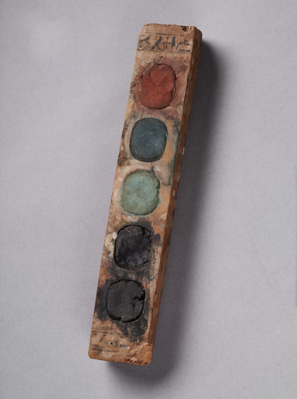
The alternative was to make blue rather than mine it, and somebody did. Egyptian blue is calcium copper silicate, the synthetic equivalent of the rare mineral cuprorivaite, produced by firing sand, a copper source, lime and a flux together at around 850 to 1000 degrees Celsius. It is the earliest known deliberately manufactured pigment, in use in Egypt from the Old Kingdom onward, roughly the middle of the third millennium BCE, and it spread across the Mediterranean and as far as Persepolis. A single origin year is often quoted for it and this page does not print one: attestation runs from the Old Kingdom, and nothing the research behind this article resolved fixes a first-made date more precisely than that. What has been reconstructed experimentally, from analysis of surviving frit, is the second-millennium production technology, in work by Hatton, Shortland and Tite published in 2008.
Egyptian blue also does something its makers had no way of detecting. Excited by visible light it emits strongly in the near infrared, with an exceptionally high quantum yield and a long emission lifetime, a property characterized by Accorsi and colleagues in 2009. Conservators exploit it. A photograph taken through an infrared filter makes traces of Egyptian blue glow bright against everything around them, so painted decoration invisible to the eye after three thousand years of weathering can be recovered from stone that looks bare, including on Greek and Roman sculpture long assumed to have been left white. A pigment chosen for how it looked turns out to have left a signature in a band nobody could see.
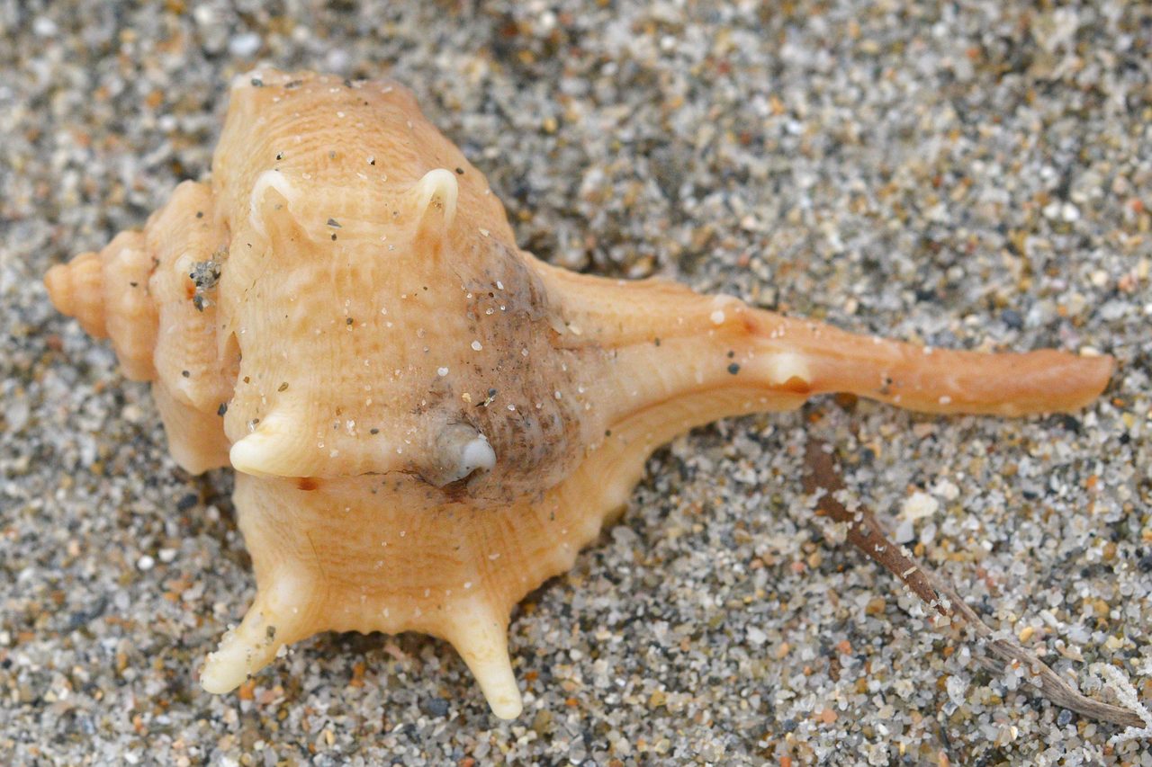
Purple was harder than blue. Tyrian purple is 6,6'-dibromoindigo, extracted from a gland in several Mediterranean sea snails, principally Bolinus brandaris, long known as Murex brandaris, along with Hexaplex trunculus and Stramonita haemastoma. The fresh secretion is not purple at all: it is a colorless precursor that develops through yellow and green to purple only on exposure to light and air, which is why the process is so laborious and why the dye was a Phoenician specialty tied to particular stretches of coast. Christopher Cooksey set the chemistry out in a 2001 review. The name of the city of Tyre and the trade are inseparable.
Tyrian purple was priced above gold by weight in the Roman world, and the direction of that comparison is defensible. The Edict of Diocletian, the empire's schedule of maximum prices issued in 301 CE, prices purple-dyed silk by the pound at a level far above the same weight of gold, and Roman law progressively restricted the deepest purples to the emperor. What this page will not print is the multiple. The research behind this article could not resolve it: figures for gold in the same Edict differ between reconstructions, so the resulting ratio circulates as anything from roughly twice to more than twenty times, and popular sources routinely substitute purple-dyed silk, a finished luxury textile, for raw dye, which is a different commodity being priced. Direction is a claim the evidence supports. A number is not, so there is no number here.
Every version of the thousands-of-snails-per-gram statement in circulation descends from a single experiment, and it is worth naming rather than repeating as folklore. In 1909 the chemist Paul Friedlaender processed a large quantity of Murex brandaris in order to isolate and identify the dye, and reported a yield in the region of 1.4 grams of pure dye from about 12,000 snails, which is on the order of eight or nine thousand animals per gram. That is the paper that established the compound as a dibromoindigo. Two things about how it reaches you here. The figure belongs to Friedlaender's experiment and to the material and methods he used, not to murex dyeing in general. And the research behind this article did not read his original German text, so the numbers themselves are carried at second hand and are given attributed rather than flat.
The emperors-only version of purple is also too simple. In 2021 Naama Sukenik and colleagues reported wool textile fragments dyed with true molluscan purple from Slaves' Hill in the Timna Valley, Israel, radiocarbon-dated to around 1000 BCE, with chemical analysis identifying the molluscan dye compounds directly in the fibers. They are the earliest known examples of textile actually dyed with royal purple found in the southern Levant, and they come not from a palace but from a copper-smelting camp in the desert. Whoever wore purple there, it was not a Roman emperor.
The most technically remarkable pigment in this section is not from the Mediterranean at all. Maya blue is neither a mineral nor a dye but a hybrid of the two: indigo from the anil plant bonded into the channels of palygorskite, a fibrous clay. The bond is what makes it extraordinary. Ordinary organic blues fade, and the Maya lowlands are hot and wet, yet Maya blue survives on murals, pottery and figurines after more than a thousand years and resists acids, alkalis and solvents that destroy most pigments. Electron microscopy reported in Science in 1996 characterized it as an ancient nanostructured material. In 2008 the excavation of a bowl from the Sacred Cenote at Chichen Itza yielded the first direct evidence of how it was made, with indigo, palygorskite and copal incense burned together as part of a ritual, which means the manufacturing process and the ceremony were the same event.
| The Pigment | What It Is | What Stands Behind It Here |
|---|---|---|
| Red ochre, worked at Blombos Cave | Iron oxide, compounded into a deliberate mixture and stored in two abalone shells with the tools used to make it, in a layer dated to about 100,000 years ago | A 2011 paper in Science. It supports the oldest known pigment-making workshop and does not support the earliest pigment use, which is the wording our own file uses |
| Egyptian blue | Calcium copper silicate, the synthetic equivalent of cuprorivaite, fired from sand, a copper source, lime and a flux at around 850 to 1000 degrees Celsius. The earliest known deliberately manufactured pigment | In use from the Old Kingdom onward, roughly the middle of the third millennium BCE. No single origin year is printed here because none was resolved. The second-millennium production technology was reconstructed experimentally in 2008, and the near-infrared luminescence conservators now use to find it was characterized in 2009 |
| Ultramarine, from lapis lazuli | Ground and purified lapis, from Sar-e-Sang and neighboring workings in Badakhshan, effectively the only serious source for most of recorded history | The most expensive pigment in the European painter's cupboard, written into Renaissance contracts by grade and price per ounce. No ratio against gold is printed: the research behind this article found no reliable one |
| Tyrian purple | 6,6'-dibromoindigo from a gland in Bolinus brandaris, Hexaplex trunculus and Stramonita haemastoma, developing from a colorless precursor through yellow and green to purple in light and air | The chemistry is settled and cited. The price direction is defensible from the Edict of Diocletian of 301 CE. The multiple is not printed. The yield figure belongs to Friedlaender's 1909 experiment and is attributed to it |
| Maya blue | Indigo from the anil plant bonded into the channels of palygorskite clay, a hybrid organic and mineral pigment that resists acids, alkalis and solvents | Characterized as an ancient nanostructured material in Science in 1996; the production method evidenced directly in 2008 by a bowl excavated from the Sacred Cenote at Chichen Itza |
03The Blue Road, And The Year It Closed
Natural ultramarine was the most expensive pigment in the European painter's cupboard, and Renaissance patrons wrote it into contracts by grade and by price per ounce, because it was not a thing that could be left to the painter's discretion. That much is safe to say. What this page will not do is put a ratio on it, for the same reason it printed no ratio for purple: the claim more expensive than gold circulates for ultramarine in as many incompatible forms as it does for Tyrian purple, and the research behind this article found no single reliable figure. One indirect anchor is real and is worth having. When the Societe d'Encouragement pour l'Industrie Nationale offered a prize in 1824 for a synthetic substitute, it set as a condition of the award that the product cost no more than three hundred francs per kilogram, a ceiling that only makes sense against a natural article costing very much more.
In 2019 a team analyzing the dental calculus of a woman buried around 1000 to 1200 CE at a small religious community in Dalheim, Germany, found lapis lazuli particles embedded in the hardened plaque on her teeth. The most economical explanation the authors offer, among several they consider, is that she painted with ultramarine and pointed her brush with her lips. It is an inference and it is presented here as one. What the particles establish on their own is narrower and still remarkable: a woman in that community had the single most expensive pigment available in medieval Europe in her mouth, in a period whose manuscript production is overwhelmingly credited to men.
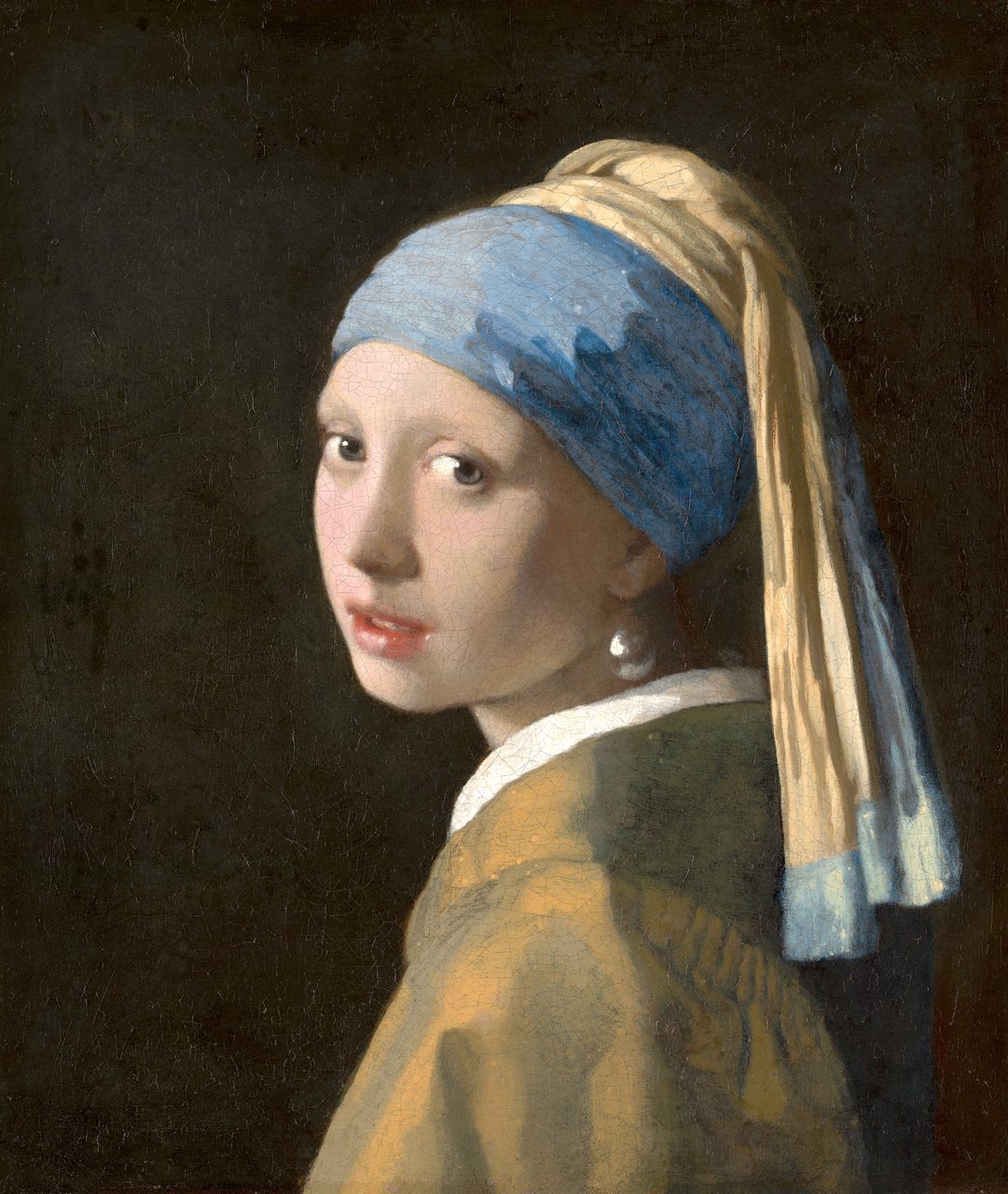
The same material turns up where a modern reader will already have seen it without knowing. The Mauritshuis carried out a technical examination of Vermeer's Girl with a Pearl Earring in 2018, published across a set of papers in Heritage Science, mapping the painting's materials layer by layer with macro-scale and micro-scale imaging. The blue of the head cloth is natural ultramarine, ground from lapis, used by a painter in a Dutch provincial town on a picture with no commission attached to it. That identification is a laboratory result, not something anyone can see, and the cost of the material is part of what the picture is.
The monopoly of the Badakhshan mines ended in a chemistry laboratory. In 1824 the Societe d'Encouragement pour l'Industrie Nationale in Paris offered six thousand francs for a synthetic ultramarine costing no more than three hundred francs a kilogram. Nothing adequate was submitted for four years. On 4 February 1828 the prize went to Jean-Baptiste Guimet, who had worked out a process in 1826 and kept it secret; Christian Gottlob Gmelin at Tubingen published a different route about a month later and claimed priority, and the two men argued about it for years. Two dates in that paragraph are load-bearing and two are not: 1824 and 1828 come from the historical study cited below, while the 1826 date for Guimet's process and the exact interval before Gmelin's publication rest on the standard account rather than on a document read for this article. What is not in doubt is the consequence. Within a generation the color that had been rationed by the ounce could be bought by the pound, and the whole economics of blue collapsed.
04What The Nineteenth Century Made, And What It Cost
Mummy brown was a real artists' pigment: a warm transparent brown made by grinding up Egyptian mummies, human and animal, sold by London colormen into the twentieth century. Sally Woodcock's 1996 study for The Conservator is the standard scholarly treatment and traces the trade through the colormen's own records. The story everyone knows about it needs its source attached rather than being repeated as fact. Edward Burne-Jones, on discovering what was in the tube, is said to have taken it into the garden and buried it; that account comes from Georgiana Burne-Jones's 1904 memoir of her husband, which is a memoir and is cited here as one.
Two of the century's most popular greens were arsenic compounds. Scheele's green, copper arsenite, was described by Carl Wilhelm Scheele in 1775. Emerald green, also sold as Paris green and Schweinfurt green, is copper acetoarsenite and dates from about 1814. They were brilliant, cheap and everywhere: in paint, in fabric, in artificial flowers, in children's toys, and above all in wallpaper. Chemical analysis of Morris and Company's own floral wallpapers confirmed that the foliage was printed with arsenical greens, which is a useful detail for anyone inclined to think of the arts-and-crafts interior as the safe alternative to the industrial one.
The harm was real and the mechanism most often given for it is contested, and dropping either half makes the paragraph false in one direction or the other. Arsenical pigments genuinely sickened and killed people through direct handling, dust and ingestion, particularly among the women and children who made artificial flowers and dyed fabrics; James Whorton's history of the period documents the scale of it. The specific and endlessly repeated story is a different claim: that damp wallpaper mold converted the arsenic into a lethal gas which killed sleepers in their beds and possibly Napoleon in his. William Cullen and Ronald Bentley argued directly in 2005 that the toxicity attributed to trimethylarsine, the gas in question, is an urban myth, because it is far less acutely toxic than the story requires. So the poisoning happened. The most cinematic route to it is the one under dispute.
That is the end of the documented half. Most of what is above rests on excavation reports, chemical analyses, technical examinations of specific objects and dated archival research; the places where it does not are flagged where they arise and again in the source notes at the foot of the page. And where a figure could not be resolved, this page has said so and left the figure out. What follows is a different kind of evidence entirely, and it needs to be read differently.
05Do All Languages Divide The Spectrum The Same Way?
Brent Berlin and Paul Kay published Basic Color Terms: Their Universality and Evolution with the University of California Press in 1969. Their method combined direct elicitation from native speakers of twenty languages, carried out largely with speakers available around the San Francisco Bay Area, with published descriptions of a further seventy-eight languages, for the ninety-eight-language total our own file reports. The book proposed that basic color terms are not arbitrary across languages, and that they enter a language in a constrained order. This paragraph is a statement about what was published, by whom, and how. Whether the proposal is true is the rest of this section.
The sequence they proposed runs: black and white first, then red, then green and yellow, then blue, then brown, then purple, pink, orange and gray in no fixed order among themselves. Stated as an implicational hierarchy rather than as a historical narrative, it predicts that a language with a basic term for blue will also have one for red, and never the reverse. That is the claim in its exact form, and stating it exactly matters, because the version that circulates is usually a story about languages evolving up a ladder, which is a stronger and more vulnerable thing to assert than an implicational pattern.
The framework did not stand as published. Paul Kay and Luisa Maffi drew in 1999 on the World Color Survey, a data set covering 110 unwritten languages, and replaced the original rigid ladder with a looser account driven by partition and composite categories, in which languages carve the color space by successive divisions rather than by adding fixed terms in a fixed order. That revision is often left out of popular accounts, which tend to cite the 1969 ladder as though the intervening thirty years had not happened.
English has eleven basic color terms and that number is not a universal maximum. Russian carries twelve, because goluboy, light blue, and siniy, dark blue, function as two separate basic terms rather than as light and dark shades of one, in the same way English treats red and pink as two terms rather than as light and dark red. Galina Paramei's 2005 paper is the dedicated argument that the two Russian terms meet the criteria for basic-term status. Keep that pair in mind: they return in section 07 as the most precisely measured effect on this page.
The universals claim has been attacked on method, on sampling and on premise, and the attack is serious rather than fringe. Saunders and van Brakel argued in a 1997 target article in Behavioral and Brain Sciences that the constraints Berlin and Kay reported are artifacts of the elicitation apparatus itself, in particular of using a fixed Munsell chip array that presupposes the hue-centered organization it then claims to discover. Stephen Levinson's 2000 study of Yeli Dnye, spoken on Rossel Island in Papua New Guinea, argued that the language has no basic color terms in the Berlin and Kay sense at all, its color vocabulary being small, largely derived from object names, and resistant to the elicitation the theory requires. And Debi Roberson, Ian Davies and Jules Davidoff's 2000 study of the Berinmo of Papua New Guinea, and Roberson, Davidoff, Davies and Laura Shapiro's 2005 study of the Himba of northern Namibia, reported categorical-perception boundaries that track each language's own color divisions rather than any universal set.
The universals side answered, and the answer is statistical rather than absolute, which is the single most important thing to understand about the current state of this argument. Paul Kay and Terry Regier's 2003 analysis of the World Color Survey reported that color naming across its 110 languages clusters far more tightly than chance would produce. Terry Regier, Kay and Richard Cook argued in 2005 that best-example choices for color terms cluster near the same regions of color space across unwritten languages. Regier, Kay and Naveen Khetarpal argued in 2007 that attested color vocabularies sit near optimal partitions of a perceptual color space, so that the regularity is a consequence of efficient division rather than of an innate list of terms. Kay and Regier replied directly on Berinmo the same year. The upshot is that a strict universal sequence is not established, while a statistical universal tendency in where languages place their boundaries is well supported.
A 2017 study reframed the question as one about communication rather than perception, and it is the most useful recent contribution here. Edward Gibson and colleagues found that across many languages warm colors, the reds and oranges and yellows, are communicated more efficiently than cool ones, and argued that the asymmetry follows from what color is used for: objects that matter to people tend to be warm-colored against cooler backgrounds, so warm regions of the space get finer and more agreed-upon labels. On that reading a language's color vocabulary reflects its speakers' visual environment and their needs, which explains a regularity across languages without requiring an innate list of terms at all.
| The Position | What Is Argued | What It Rests On |
|---|---|---|
| The original proposal, 1969 | Basic color terms are not arbitrary across languages, and they enter a language in a constrained order: black and white, then red, then green and yellow, then blue, then brown, then the rest | Direct elicitation from speakers of twenty languages plus published descriptions of seventy-eight more, for a ninety-eight-language total. Revised by its own authors in 1999 into a looser partition account drawn from 110 unwritten languages |
| The critique | The reported constraints are artifacts of the method; at least one carefully documented language has no basic color terms in the required sense; categorical-perception boundaries track each language's own divisions rather than a universal set | A 1997 Behavioral and Brain Sciences target article on the Munsell-array method, a 2000 study of Yeli Dnye on Rossel Island, and field studies of the Berinmo in 2000 and the Himba in 2005 |
| The defense | Not a fixed ladder, but a statistical tendency: color naming clusters far more tightly than chance, best-example choices land in similar regions, and attested vocabularies sit near optimal partitions of the color space | Four papers in PNAS between 2003 and 2007, plus a direct reply on Berinmo in Cognition in 2007 |
| The reframing | The regularity is about communication, not perception: warm colors are communicated more efficiently, because the objects that matter tend to be warm-colored against cooler grounds, so those regions get finer labels | A 2017 cross-language study in PNAS. It accounts for the pattern without an innate term list, which is why it dissolves part of the older argument rather than settling it |
The honest state of the question, sixty years on. Berlin and Kay's book changed the field and its central intuition survived: languages do not divide the spectrum at random. Its specific claims did not survive intact. The fixed evolutionary sequence is not established and is contradicted by at least one carefully documented language. What is supported is weaker and considerably more interesting: color vocabularies cluster far more than chance allows, plausibly because efficient division of a shared perceptual space and shared communicative pressures push independent languages toward similar solutions. Anyone who tells you the sequence is a settled law of language is overstating it. Anyone who tells you color naming is purely arbitrary is overstating it in the other direction. This page does not settle it, because it is not settled.
06Homer's Wine-Dark Sea
In 1858 William Ewart Gladstone, then a Member of Parliament and later four times Prime Minister, published a three-volume study of Homer whose third volume contains a long section on Homer's use of color. Gladstone had counted, and what he found is genuinely striking: Homer's color vocabulary is small, it is applied in ways that make no sense as hue, with the sea wine-looking and oxen wine-looking and honey green and sheep violet, and there is essentially no word doing the work English gives to blue. From that observation Gladstone inferred that the color sense of the Homeric Greeks was only partially developed. Hugo Magnus extended the inference in 1877 into a full evolutionary hypothesis: that color vision itself had developed within recorded history. The counting was real. The inference was not warranted, and the next paragraph is why.
Refused: that ancient Greeks, or Homer, or any historical population, could not see blue, had undeveloped color vision, or were in any sense physiologically color-blind. There is no evidence for it and there is evidence against it. The hypothesis was tested in its own century and it failed. W. H. R. Rivers, working on the Cambridge Anthropological Expedition to the Torres Straits in 1898 and publishing in 1901, administered color-vision tests to people whose languages had few color terms and found their discrimination normal. Nothing since has revived it. Human color vision is a property of the three cone opsins described in section 01, and there is no evidence of a change in those genes over the two and a half thousand years since Homer was written down. The perceptual story survives entirely as internet folklore, and it is worth noticing that it survives by being flattering in a particular way: it invites a modern reader to believe they can see something a Greek could not.
The defensible version is about words, not eyes, and it is better than the folklore version rather than a consolation prize for it. Ancient Greek color vocabulary was organized around axes English does not foreground: brightness, darkness, saturation, wetness, and the way a surface glitters or moves. Two Greek words cover much of what English calls blue. Kyaneos names a dark shade running into black, and glaukos a pale blue-gray with a gleam to it, the word behind Athena's epithet glaukopis. Neither is a hue label in the modern sense. A Greek could see the sea perfectly well while having no single word that meant its hue and nothing else. That is a claim about how a language cuts up experience, which is precisely the claim the entire color-terms literature in section 05 is about, and it is the reason Gladstone's counting still matters.
07What Language Actually Does, Measured
The best-known demonstration that a language's color categories affect performance is Jonathan Winawer and colleagues' 2007 study of Russian and English speakers, and it is worth reporting in full because the full version is smaller and more interesting than the headline. Participants saw three blue squares and pressed a key to say which of the lower two matched the upper one. Russian speakers were faster when the two lower squares fell on opposite sides of the goluboy and siniy line than when both fell inside one category. The size of that advantage, in the hardest trials where the two blues were perceptually close, was 124 milliseconds: 1,288 milliseconds within category against 1,164 across it. English speakers, tested on the identical squares, showed no such advantage in any condition. A concurrent verbal task wiped the Russian advantage out, turning the 124 milliseconds into minus 64, while a concurrent spatial task did not, leaving 109 milliseconds. That last contrast is the substance of the finding: it suggests the language is being recruited online, during the task, rather than having permanently reshaped the eye. One hundred and twenty-four milliseconds in a speeded button-press is a real effect and an invisible one in ordinary life. It is not that Russian speakers see more blues.
Debi Roberson and colleagues worked with the Himba of northern Namibia and the Berinmo of Papua New Guinea, both of whom have color vocabularies that group parts of what English calls green and blue under one term. Across recognition, similarity-judgment and category-learning tasks, both groups showed categorical-perception effects aligned to their own language's boundaries rather than to English ones. Read the dependent variable carefully, because everything downstream turns on it: what the studies measured throughout was speed of response and rate of error. At no point did they report a participant unable to tell two colors apart. A separate note is owed on the citation itself. Our own file U_2_01 cites this material through an entry that merges the 2000 Berinmo paper's title with the 2005 Himba paper's year, and gives a volume, issue and page range that match neither of them. Both papers are cited separately and correctly below.
Refused: the version of the Himba experiment that circulates online, in which participants instantly spot one odd green square among eleven near-identical greens but cannot find a blue square among greens at all. It is not a published finding. It was staged for a 2011 BBC Horizon program. Debi Roberson, one of the researchers whose work the program drew on, wrote of the actual literature that "the differences found have been in the speed of identification of the oddball, and sometimes in a greater number of errors. I'm not aware of any finding ... where a participant has failed to spot an oddball." Jules Davidoff confirmed that the televised stimuli "were modeled on those used by Paul Kay and others in experiments on other groups; but in all of the relevant experiments, the dependent measure was reaction time." Both statements come from correspondence published by Mark Liberman on Language Log, the University of Pennsylvania linguistics blog, on 17 March 2015, and that page is linked below. This is the cleanest correction available in the whole subject: a real effect, real studies, and a famous distortion refuted in the words of the people whose work it claims to report.
So the framing our own file uses is the right one and is carried forward here without softening it. The strong form of the Sapir-Whorf hypothesis, linguistic determinism, holds that language determines what can be perceived or thought, and is largely rejected. The weak form, linguistic relativity, holds that language influences perception and cognition, and in the color domain it is supported by studies of the kind above. The file's own closing hedge is carried forward exactly as it stands: effect sizes are small, and perceptual categories may be shaped by both biology and language. A hundred and twenty-four milliseconds is what supported looks like here. Anyone reporting linguistic relativity in the color domain as a dramatic reshaping of experience is reporting something the measurements do not contain.
08The Meanings, And Where They Came From
Which leaves the part of the subject that gives this article its title. Colors carry symbolic weight that does not follow from the physics at all, and the systems that assign it are elaborate, old, and mutually contradictory. The ones set out below each carry their real date or their real limit, because in more than one case the version in circulation is more confident than the evidence supports.
The Roman Catholic liturgical year is color-coded, and the code is old: white for Christmas and Easter and for the feasts of confessors and virgins, red for Pentecost and for martyrs and the Holy Cross, green for Ordinary Time, violet for Advent and Lent, and black for funerals, now optional. Our own file dates the codification to 1198 and attributes it to Pope Innocent III, and both halves of that are imprecise. The program is set out in De sacro altaris mysterio, Book I chapter 65, a treatise written in the 1190s by Lotario dei Segni before his election as Innocent III, that is, while he was still a cardinal. And the Council of Trent did not legislate a color sequence; the rubrics were fixed in their familiar form by the Roman Missal of 1570 that followed the Council. One honest limit on this paragraph: the research behind this article did not locate a peer-reviewed article specifically dating the treatise. The pre-election composition date is standard in the liturgical literature, and the primary text sits in Migne's Patrologia Latina volume 217, for which no stable public locator was resolved, so it is named here rather than linked.
Two comparisons are worth a sentence each and no more than that, and both come from our own file with no external source resolved for either, which is stated here rather than left for a reader to discover. Eastern Orthodox practice is less standardized than the Roman but follows a comparable symbolic logic. Buddhist iconography works with a five-color set, white, blue, red, yellow and green, associated with the five Buddhas and the five wisdoms. Neither carries any weight in this article's conclusions, and no section is built on either.
Chinese five-phase cosmology assigns a color to each of the five phases: wood green, fire red, earth yellow, metal white, water black. The scheme runs through medicine, siting, court ritual and political legitimacy rather than sitting in a book about art. Its most visible consequence for a Western reader is that white, not black, is the color of mourning: white hemp garments at a funeral, where a European tradition would wear black. Our own file frames that as simply the opposite of Western convention, and the framing is worth keeping loose, because mourning color in Chinese practice is graded by the mourner's relationship to the dead rather than being one uniform color for everybody in the room.
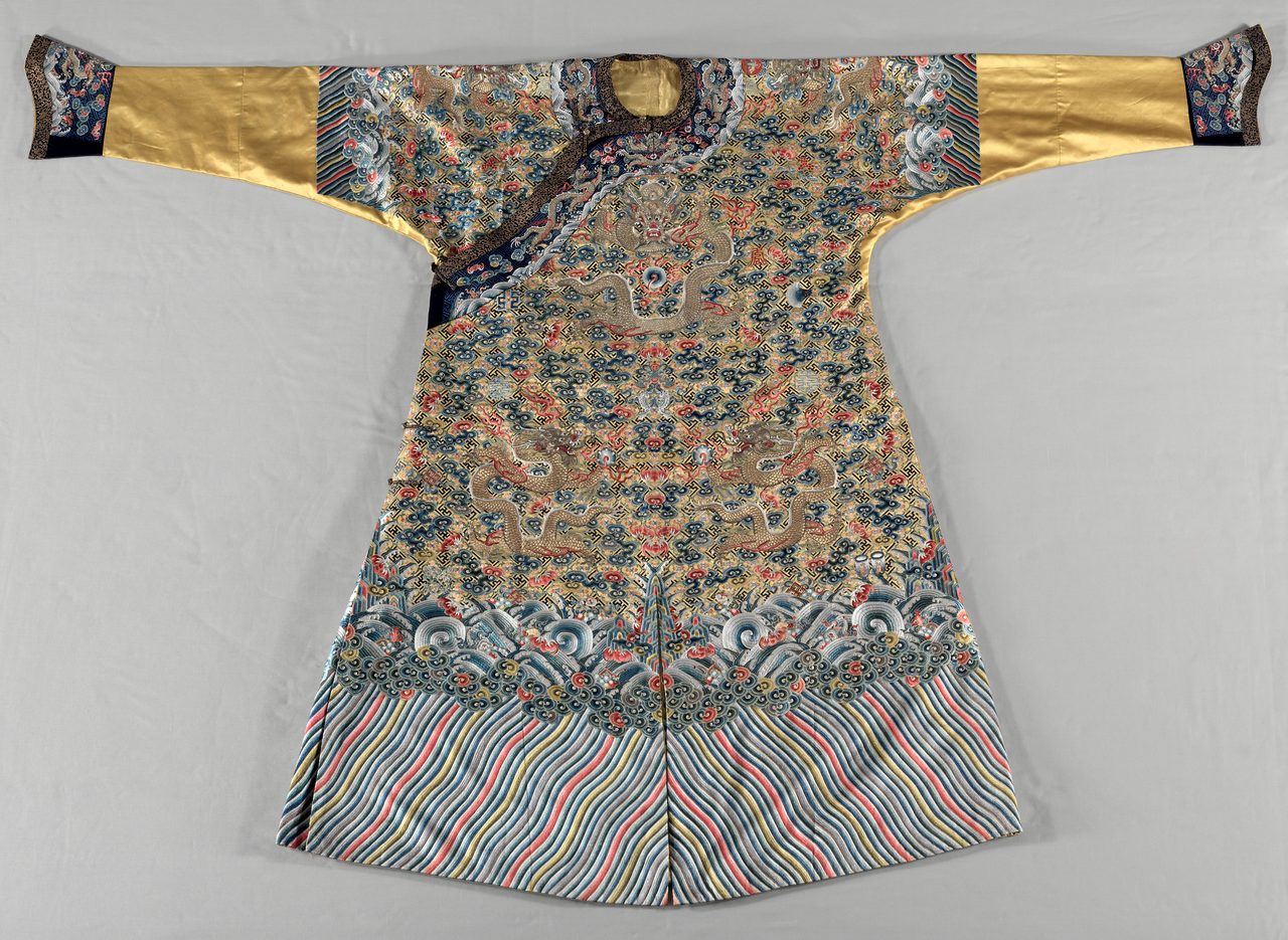
Yellow was the emperor's color under the Qing, and the restriction was written into sumptuary regulation rather than being a matter of taste. It was graded by shade, with the brightest yellow reserved at the very top and lesser yellows allotted to ranks below. The Cleveland Museum of Art's own catalogue entry for its Jiaqing-period semi-formal court robe records that yellow indicated imperial status and was reserved for the emperor and consorts. Our own file adds that commoners using imperial yellow could be executed. No source found in the research behind this article substantiates execution as the actual sanction, so the restriction is printed here and the penalty is not.
The seven-chakra rainbow, red at the root through violet at the crown, is not an ancient Indian scheme. Classical Sanskrit sources including the sixteenth-century Sat-Cakra-Nirupana do assign colors to chakras, but not this sequence and not on this logic. The rainbow mapping is a Western construction, assembled through Theosophical writing and reaching its familiar modern form in the twentieth century, with Christopher Hills's Nuclear Evolution of 1977 the usual point of consolidation. Kurt Leland's book-length history traces the assembly step by step, from Blavatsky through Leadbeater, Steiner, Bailey, Jung and Esalen to the 1970s, and notes that the version now in universal use came together as recently as 1977. The tell is sitting in plain sight: the sequence happens to match the Western spectral order, which is not something a sixteenth-century Sanskrit text would have any reason to reproduce.
Set two of these systems side by side and the article's central observation makes itself without commentary. In Chinese practice red carries luck, prosperity and protection: red envelopes of money at New Year and at weddings, red as the traditional color of a bride's dress, red on doorways and lanterns. In the same tradition white, not black, is the color of mourning, and a European tradition would wear black to the same funeral. Two traditions, one set of wavelengths, opposite assignments, and nothing in the physics to arbitrate between them. One scoping note. The mourning-color material is sourced below; the observations about red rest on our own file alone, with no external source resolved for them, so they are offered here as a widely known cultural observation and not as a finding.
09The Century Color Became A Science
Michel Eugene Chevreul, director of dyeing at the Gobelins tapestry works, was asked why certain dyed yarns looked duller than they should, and found the problem was optical rather than chemical: adjacent colors change each other's appearance. He published the law of simultaneous contrast in 1839, as De la loi du contraste simultane des couleurs. A gray patch on a red ground looks greenish; the same gray on a blue ground looks yellowish. He systematized complementary relationships into a chromatic circle and showed that juxtaposing complementaries makes both look more saturated. Ogden Rood's Modern Chromatics of 1879 added the distinction between additive mixing of light, which brightens, and subtractive mixing of pigment, which darkens, which is why broken strokes of pure color read as more luminous than the same colors mixed on a palette. This material comes from our second file, U_2_19, and only this layer of it: what the painters did with it is that file's subject and not this article's. The research behind this article resolved no identifier for Chevreul's or Rood's own works, so neither man's book is linked below, and the source notes say so.
Goethe published Zur Farbenlehre in 1810 as a direct attack on Newton, arguing that color arises where light meets darkness through a turbid medium rather than being decomposable into a spectrum. As physics he was wrong and Newton was right, and nothing here softens that. As phenomenology he recorded a great deal worth recording: colored shadows, afterimages, simultaneous contrast, the psychological weight of particular colors. Schopenhauer took the theory up and modified it, and its influence runs through Steiner, Wittgenstein's Remarks on Colour and Albers's Interaction of Color. It is the clearest case in this article of a book being scientifically false and intellectually productive at the same time, which is a combination our tier system is built to say out loud rather than to resolve.
10What Color Psychology Can And Cannot Show
Whether color-emotion associations are universal is open. Domicele Jonauskaite and colleagues surveyed more than four thousand participants across thirty nations in 2020 and found substantial cross-national agreement in which emotions people attach to which colors, together with real variation: the association of yellow with joy, for instance, appeared in most but not all of the samples. The pattern that emerged is that the similarity between two nations' color-emotion maps tracks how close their languages and their geography are, which is what you would expect if the associations are partly shared and partly transmitted rather than either purely innate or purely arbitrary. Whether the shared part reflects biology, a shared environment such as blue sky and red blood, or cultural diffusion, is unresolved. The participant total here is given as more than four thousand rather than as an exact figure, because the exact figure was carried from the standard description of the paper rather than from a table read for this article.
Experimental color psychology has had a hard decade, and two of its most publicized findings are now doubtful. Russell Hill and Robert Barton reported in Nature in 2005 that competitors assigned red in four Olympic combat sports won more often than those assigned blue; the effect has since been contested on analysis and on generality. The romantic-red finding, that men rate women as more attractive against a red background, was subjected to two pre-registered replications by Gabrielle Lehmann and Robert Calin-Jageman in 2017, which found effects far smaller than the original and not clearly distinguishable from zero. Andrew Elliot's own 2015 review of the field is candid that the literature was built on small samples and thin theory and that the robust findings are few. That review is by a researcher inside the field rather than a critic outside it, which is what makes it worth the space.
Refused as fact: the marketing folklore of color. That red increases appetite. That blue suppresses it. That blue is calming. That a particular shade of pink pacifies violent prisoners. That a specific color on a button raises conversion. These circulate as established psychology and they are not. Some rest on single small studies that did not replicate, and some on no published study at all. What is true, and worth reporting as true, is that these claims are widely made and widely believed, and that whole design practices have been built on them. The honest summary is the one from inside the field: its robust results are few, and the confident claims in circulation are mostly not among them.
Synaesthesia, in which a stimulus in one modality reliably produces an experience in another, includes the color cases: seeing letters, numbers, days of the week or musical notes as colored. The prevalence figure our own file gives, around four percent, has a real study behind it. Julia Simner and colleagues in 2006 tested 500 people in the first study to screen a large population without relying on self-referred volunteers, and put the overall prevalence of synaesthesia at 4.4 percent, with about one percent for the grapheme-color form specifically. Ramachandran and Hubbard proposed in 2001 that the condition reflects excess cross-activation between adjacent cortical areas, and demonstrated psychophysically that synaesthetic color can affect perceptual grouping, which argues that the experience is perceptual rather than merely associative. The subject has its own page in this library, synaesthesia, and the fuller picture, including why prevalence figures disagree with each other, belongs there rather than here.
One further idea is carried here exactly as our own file carries it, which is to say with its own refutation in the same breath. U_2_01 floats the hypothesis that synaesthesia may be a survival of an ancestral perceptual mode more common in earlier humans, and states in the same sentence that there is no direct evidence for the evolutionary claim. That is the whole of it. The genetics of synaesthesia are under active study; the relic-perception story is a speculation with nothing under it, and it appears on this page only because leaving it out would misrepresent what the file we are working from actually says.
Refused, and our own file refuses these too, which is worth noting because much of this page has been spent correcting that file and here it is right. That chromotherapy, shining colored light on the body, cures disease: no controlled evidence supports it. That ancient Egyptians operated color-healing chambers inside the pyramids: no archaeological support of any kind. That aura colors provide reliable medical diagnostic information: no. And the shape of that refusal is worth stating plainly rather than leaving as a list. Color genuinely carries enormous cultural and psychological weight, which is exactly why claims of physical healing power attach to it so readily and so persistently. The meaning is real. The medicine is not.
11The Newest Blue
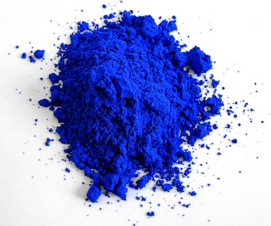
The most recent inorganic blue was found by accident. In 2009 a group at Oregon State University led by Mas Subramanian was heating manganese oxide with other compounds while looking for electronic materials, and a graduate student, Andrew Smith, pulled a vividly blue powder out of the furnace. The color comes from manganese in an unusual trigonal bipyramidal coordination, and the compound is written YIn(1-x)Mn(x)O3, which is where the trade name YInMn comes from. It is durable, it does not fade, and it contains none of the cadmium or cobalt that make older bright blues problematic. On the university's own account the United States Environmental Protection Agency cleared it for industrial coatings and plastics in 2017 under a low-volume exemption and for general commercial use in 2020, and Crayola named a crayon after it in 2017. Those two clearance dates are attributed to the university's own newsroom rather than to an agency document read for this article, which is why the attribution is in the sentence rather than in a footnote.
Which is a strange place to end up. A stone hauled out of one valley in the Hindu Kush and carried across a continent, a snail gland left in the light until it turned purple, a clay and a plant bonded together so tightly that the result outlived the civilization that made it, a furnace in Oregon in 2009. None of that is disputed. And the thing we cannot settle, sixty years and a hundred and ten surveyed languages later, is what happens when somebody points at one of them and says a word.
Fast Facts
- The Rule This Page Is Written Under
- A photograph of a pigment is not a colorimetric record. Sensor, white balance, processing, color profile, the reader's screen and the reader's room all move the color. This article says what a pigment is, where it came from, what it cost and what it meant, and rests no claim on how a color looks in a web image
- The Oldest Pigment Workshop
- Two abalone shells holding a deliberately compounded ochre mixture, with grindstones, hammerstones and bone, at Blombos Cave on the southern Cape coast of South Africa, in a layer dated to about 100,000 years ago and published in Science in 2011. That is the oldest known pigment-making workshop. It is not the earliest pigment use, which is the wording our own file uses and the paper does not support
- Egyptian Blue
- Calcium copper silicate, the synthetic equivalent of cuprorivaite, fired from sand, a copper source, lime and a flux at around 850 to 1000 degrees Celsius. The earliest known deliberately manufactured pigment, in use from the Old Kingdom onward, roughly the middle of the third millennium BCE. No single origin year is printed here. Excited by visible light it luminesces in the near infrared, which is how conservators now find traces of it on stone that looks bare
- Tyrian Purple
- 6,6'-dibromoindigo, from a gland in Bolinus brandaris and related snails, developing from a colorless precursor through yellow and green to purple in light and air. Priced above gold by weight in the Roman world, on the evidence of the Edict of Diocletian of 301 CE. The multiple is unresolved and is not printed here: reconstructions differ on the gold side of the comparison, and popular versions substitute purple-dyed silk, a finished textile, for raw dye
- The Snail Yield
- About 1.4 grams of pure dye from roughly 12,000 Murex brandaris, on the order of eight or nine thousand animals per gram. That figure belongs to Paul Friedlaender's 1909 identification experiment and is attributed to it here rather than stated as a general fact, and the research behind this article did not read his original German text
- Ultramarine, And The Year Its Price Collapsed
- Ground lapis from effectively one district in Badakhshan; the most expensive pigment in the European painter's cupboard; written into Renaissance contracts by grade and price per ounce. A prize offered in Paris in 1824, requiring a synthetic version costing no more than three hundred francs a kilogram, was awarded on 4 February 1828. Within a generation the color could be bought by the pound
- What Berlin And Kay Proposed
- That basic color terms are not arbitrary across languages and enter in a constrained order: black and white, then red, then green and yellow, then blue, then brown, then the rest. Published in 1969 from twenty elicited languages plus seventy-eight published descriptions. Revised by its own authors in 1999 into a looser partition account drawn from 110 unwritten languages
- What Survived Of It
- The intuition survived: languages do not divide the spectrum at random. The fixed sequence did not, and at least one carefully documented language is a counterexample. What is supported is statistical: color vocabularies cluster far more tightly than chance allows. Both the critique and the defense are carried on this page at full strength and neither is crowned
- The Language Effect, Measured
- One study measured the effect: an advantage of 124 milliseconds in the hardest trials of a speeded button-press, across the Russian goluboy and siniy boundary, with no such advantage in English speakers on identical squares. A concurrent verbal task removed the advantage and a concurrent spatial task did not, which is the part that matters. The underlying means and the interference figures are at section 07. A real effect, and an invisible one in ordinary life
- Homer's Blue, And The Himba Square
- That the ancients could not see blue: refused. Gladstone's 1858 count of Homer's color words was real, the perceptual inference was not, and Rivers found normal color discrimination in 1898 among people whose languages had few color terms. That the Himba cannot find a blue square among greens: refused. That demonstration was staged for a 2011 BBC Horizon program, and the researchers whose work it drew on have said in print that the published studies measure reaction time and error rate
- Color Psychology, Honestly
- Red increases appetite, blue is calming, a particular pink pacifies prisoners: widely believed, and not established. Two of the field's most publicized findings, red and contest outcomes and red and attractiveness, are contested or have failed pre-registered replication. A 2015 review from inside the field says the robust results are few
- Refused At Tier 4
- That any historical population could not see blue; the televised Himba demonstration; the marketing folklore of color as established psychology; chromotherapy as a cure; color-healing chambers inside the pyramids; and aura colors as medical diagnosis
- Figures And Phrasings Refused, And Why
- No multiple of the price of gold, for Tyrian purple or for ultramarine: the research behind this article could not resolve one, so the direction is printed and the number is not. No single origin year for Egyptian blue: attestation from the Old Kingdom onward is what the evidence supports. Not 1198 as a codification date for liturgical color: the treatise was written in the 1190s, before its author's election, and the rubrics were fixed by the Roman Missal of 1570. Not execution as the penalty for a commoner wearing imperial yellow: nothing found substantiates it, so the restriction is printed and the penalty is not. And not earliest pigment use for Blombos, which is our own file's wording rather than the excavation's finding
- What Our Own Files Got Wrong
- A boilerplate note in U_2_01 declaring that no significant counter-arguments and no active scholarly dispute exist, in a document whose own body names two research groups on opposite sides of the question and ends: Debate continues. A superlative attached to Blombos that its source paper does not make. A citation that merges two different Roberson papers and matches neither on volume, issue or pages. Two bibliography identifiers that resolve to journal reviews of the books rather than to the books. A liturgical codification date and attribution that are both imprecise. And a penalty for wearing imperial yellow that nothing found could substantiate
What We Can Actually Stand Behind
The pigment history is documented. Each item below rests on a named, dated study cited on this page, with one exception flagged where it arises: the Badakhshan trade route comes from our own file and no external source was resolved for it. An ochre-processing workshop at Blombos Cave, two abalone shells and a toolkit, in a layer dated to about 100,000 years ago. Lapis lazuli from effectively one district in Badakhshan, supplying Mesopotamia, Egypt and the Indus valley. Egyptian blue as calcium copper silicate, fired at around 850 to 1000 degrees Celsius, in use from the Old Kingdom onward, and luminescing in the near infrared in a way its makers could not have known. Tyrian purple as 6,6'-dibromoindigo from a snail gland. Molluscan-dyed wool from a copper-smelting camp in the Timna Valley, radiocarbon-dated to around 1000 BCE. Maya blue as indigo bonded into palygorskite. Lapis particles in a medieval woman's dental calculus at Dalheim. Natural ultramarine identified in the head cloth of Vermeer's Girl with a Pearl Earring by the Mauritshuis's own technical examination. A prize offered in 1824 and awarded on 4 February 1828 that ended the monopoly of the Badakhshan mines. Arsenical greens dating from 1775 and about 1814. A new blue out of an Oregon furnace in 2009.
The perceptual substrate is not in dispute. Human color vision rests on three cone classes whose pigment genes were sequenced in 1986, and because the eye reduces the whole spectrum to three responses, two physically different surfaces can look identical. The brain then corrects for an illumination it never consciously estimated, which is why a page looks white under a bulb and under the sun, and why 1,401 respondents split three ways over one photograph of a dress in 2015 and stayed split. Even the exotic case comes back smaller than advertised: of twenty-four women carrying the genetic substrate for a fourth cone class, one behaved as a functional tetrachromat on a demanding task.
Language influences performance on color tasks, and the influence is real, replicated and small. The clearest measurement, from one study of Russian and English speakers, is 124 milliseconds in the hardest trials of a speeded button-press, across the goluboy and siniy boundary, with no equivalent advantage in English speakers on identical squares. A concurrent verbal task removed it; a concurrent spatial task did not, which points at language being recruited during the task rather than at a permanently reshaped eye. The Himba and Berinmo studies found categorical-perception effects aligned to those languages' own boundaries, and what they measured throughout was speed and error rate. The weak form of linguistic relativity is supported in the color domain. The strong form, that language determines what can be perceived, is not.
Whether color naming follows a universal pattern is genuinely open, and the shape of the disagreement is the substance of it. Against: the constraints may be artifacts of a Munsell-array method that presupposes what it discovers, Yeli Dnye appears to have no basic color terms in the required sense, and categorical boundaries track each language's own divisions. For: naming across 110 languages clusters far more tightly than chance, best-example choices land in similar regions, and attested vocabularies sit near optimal partitions of the space. A third position argues the regularity is about communicative need rather than perception at all. The fixed 1969 sequence is not established. A statistical tendency in where languages put their boundaries is well supported. Both overstatements are refused: it is not a settled law of language, and it is not arbitrary either.
Tyrian purple was priced above gold by weight in the Roman world, and natural ultramarine was the most expensive pigment in the European painter's cupboard. Both of those are defensible as direction. Neither is printed here with a number attached to it. Reconstructions of the Edict of Diocletian differ on the gold side of the comparison, popular sources substitute purple-dyed silk for raw dye, and no reliable ultramarine ratio was found at all. The one price anchor this page does carry is the 1824 prize condition of three hundred francs per kilogram, which is a stated ceiling in a documented competition rather than a ratio reconstructed from a schedule.
Two things stay at the speculative tier our own file assigns them. Whether color-emotion associations are universal is open: a 2020 survey of more than four thousand participants across thirty nations found substantial cross-national agreement together with real variation, and found that similarity between two nations' maps tracks linguistic and geographic proximity, which does not by itself distinguish biology from shared environment from cultural diffusion. And the suggestion that synaesthesia is a survival of an ancestral perceptual mode is carried here only because our file carries it, and only with our file's own admission attached: there is no direct evidence for the evolutionary claim.
No: no historical population, Greek or otherwise, was unable to see blue. There is no evidence for the perceptual claim and there is evidence against it. Gladstone's 1858 observation about Homer's color vocabulary was a real observation about words, and the inference he and Magnus drew from it was tested in its own century and failed: Rivers, on the Torres Straits expedition of 1898, found normal color discrimination in people whose languages had few color terms. Human color vision is a property of the three cone opsins, and no change in those genes over the historical period is evidenced. The defensible version of the story is entirely about lexicon: Greek color words were organized around brightness, darkness, saturation and glitter, and kyaneos and glaukos are not hue labels in the modern sense. The perceptual version survives as folklore, and it appears nowhere on this page as anything else.
No, Himba participants do not fail to find a blue square among greens. That demonstration was staged for a 2011 BBC Horizon program and is not a published finding. Debi Roberson, whose work the program drew on, has said in print that the differences found in the literature have been in speed of identification and sometimes in error rate, and that she is not aware of any finding in which a participant failed to spot an oddball. Jules Davidoff has said that the televised stimuli were modeled on those used in experiments on other groups, and that in all of the relevant experiments the dependent measure was reaction time. Both statements were published on Language Log in March 2015, and the exact date and the page itself are at section 07 and in the sources below. The underlying studies are real and their result is worth having. The television version reverses what they measured.
No, the marketing folklore of color is not established science. Red increases appetite, blue suppresses it, blue is calming, a particular pink pacifies violent prisoners, a specific button color raises conversion: widely repeated, widely believed, and not supported. Some of it rests on single small studies that did not replicate and some on no published study at all. Two of the field's most publicized results are in trouble, with the red-and-contests finding contested on analysis and generality and the romantic-red finding failing two pre-registered replications in 2017. A 2015 review from inside the field says the literature was built on small samples and thin theory and that the robust findings are few. That these claims are widely believed is true and is itself worth reporting. That they are findings is not.
No to chromotherapy as a treatment for disease: no controlled evidence supports it. No to color-healing chambers operated inside the pyramids: no archaeological support of any kind. No to aura colors as reliable medical diagnostic information. Our own file places all three at Tier 4 and this page keeps them there. The pattern behind the whole group is worth naming, because it is the reason this subject attracts so much of this: color really does carry enormous cultural and psychological weight, and a claim of physical healing power attaches easily to anything that already feels significant. The meaning is real. The medicine is not.
No number is printed on this page for how much more than gold either Tyrian purple or ultramarine cost, and that absence is deliberate rather than an omission. The multiple circulates from roughly twice to more than twenty times depending on which reconstruction of the Edict of Diocletian is used and on whether the thing being priced is raw dye or finished purple-dyed silk, and the research behind this article resolved neither question. Several other figures and phrasings are refused on the same principle and are named in the fast facts above: a single origin year for Egyptian blue, 1198 as a codification date for liturgical color, execution as the penalty for a commoner wearing imperial yellow, and earliest pigment use as a description of Blombos. In each case the source will not carry the precision the figure implies, and a figure that cannot be resolved is more honestly left out than hedged into place.
So the question to carry out of here is not what a color means. It is who decided, and when, and what it cost them to make the stuff in the first place. The pigments answer for themselves: a valley in the Hindu Kush, a gland in a snail, a clay bonded to a plant, a furnace in Oregon. The names are harder. A hundred and ten languages have been surveyed and they agree far more than chance would allow and far less than a fixed sequence would require, and nobody yet knows exactly why. Meanwhile the version most readers arrive with, that the ancients saw a different world, turns out to be a story about vocabulary that got retold as a story about eyes. Which is worth carrying forward on its own account: a real difference in how people talk is very easily reported as a difference in what they see.
Sources & further reading
WHERE THIS WORKED FROM, AND WHERE IT CAN BE CHECKED. This article was written from two files in our own research library, U_2_01 (Color Symbolism & Chromatic Traditions) and U_2_19 (Impressionism & Color Theory). Those files are where it worked from. They are not where it can be checked. The 48 external entries below are: 38 journal articles, reference entries and digitized works cited by digital object identifier, six books cited by ISBN and cross-checked against Open Library, and four primary or institutional records cited by their own URLs. WHAT THIS ARTICLE DECLINES FROM OUR OWN FILES, in the open, because most of the corrections on this page are to our own corpus rather than to anybody else's. U_2_01's Counter-Arguments section states that no significant counter-arguments exist in the scholarly literature for its claims and that there is no active scholarly dispute; that is false, and the same document's section 2.1 contradicts it by naming two research groups on opposite sides and closing with the words Debate continues. It is corrected in the introduction and the dispute is carried open at §05. U_2_01 describes the Blombos ochre find as the earliest pigment use; the paper it rests on reports the oldest known pigment-making workshop, which is a different and much smaller claim, and §02 prints the smaller one. U_2_01's citation for the Himba and Berinmo material merges the title of Roberson, Davies and Davidoff 2000 with the year of Roberson, Davidoff, Davies and Shapiro 2005, and gives a volume, issue and page range that match neither paper; both papers are listed separately and correctly below and the merged citation is not reproduced anywhere. Two identifiers in U_2_01's bibliography resolve to journal REVIEWS of the books they are attached to rather than to the books, which is a defect no title match can catch, so Berlin and Kay is cited here by a separately verified ISBN and the second book is not cited at all. U_2_01 dates the liturgical color codification to 1198 and attributes it to Pope Innocent III; the treatise was written in the 1190s by Lotario dei Segni before his election, and the rubrics were fixed by the Roman Missal of 1570 rather than by the Council of Trent, so this page does not assert 1198 as a codification date anywhere and names the year only in order to correct it. U_2_01 states that commoners using imperial yellow could be executed; nothing found in the research behind this article substantiates the penalty, so §08 prints the restriction and not the penalty. U_2_01's own header reports a source count of zero while its footer reports twenty, which is a known display fault in the corpus rather than a claim, and it affects nothing on this page. From U_2_19, only the nineteenth-century color science is used; Impressionism as a movement is that file's own subject and is deliberately out of scope here. WHICH CLAIMS ON THIS PAGE REST ON OUR OWN FILES ALONE. Naming these matters more than the count of external entries does, because a corpus doc is our own claim and cannot corroborate itself. The research behind this article resolved no external source for the following, and they are the ones to treat with the most caution: rod vision and color constancy at §01; the Badakhshan trade route at §02, meaning the claim that one district supplied the ancient world and that the stone traveled into Mesopotamia and Egypt in one direction and the Indus valley in the other; the strong-versus-weak distinction between linguistic determinism and linguistic relativity, used at §07 as a framing rather than as a finding; the comparative note on Orthodox and Buddhist color practice and the observations about red in Chinese practice at §08, on neither of which anything on this page is built and neither of which appears in the verdict; Chevreul's law of simultaneous contrast and Rood's additive-versus-subtractive distinction at §09, for which no identifier for either man's own works was resolved; the relic-perception speculation at §10, carried only with our file's own admission that no direct evidence supports it; and the three Tier 4 health refusals at §10, which are refusals rather than findings. WHICH PRICE AND RATIO FIGURES ARE UNRESOLVED AND THEREFORE UNPRINTED. No multiple of the price of gold appears anywhere on this page, for Tyrian purple or for ultramarine. For purple, the Edict of Diocletian's own gold figures differ between reconstructions and popular versions silently substitute purple-dyed silk for raw dye, so the reported ratio circulates from roughly twice to more than twenty times and none of those numbers is defensible from anything resolved here; the direction is printed and the multiple is not. For ultramarine, no single reliable figure was found at all, and the only price anchor carried is the 1824 prize condition of three hundred francs per kilogram, which is a stated ceiling in a documented competition rather than a ratio reconstructed from a schedule. The murex yield figure, about 1.4 grams from roughly 12,000 snails, is attributed to Paul Friedlaender's 1909 identification experiment rather than stated as a general fact. A single origin year for Egyptian blue is not printed; attestation from the Old Kingdom onward is. WHAT WAS NOT READ. Friedlaender's 1909 paper was not read in the original German; its identifier resolves and the paper is the right one, but the yield numbers are carried at second hand and are attributed accordingly. No peer-reviewed article specifically dating De sacro altaris mysterio was located; the pre-election composition date is standard in the liturgical literature, and the primary text sits in Migne's Patrologia Latina volume 217, for which no stable public locator was resolved, so it is named at §08 and is not linked below. The two clearance dates for YInMn blue come from Oregon State University's own newsroom page, linked below, and not from an Environmental Protection Agency document. The 1826 date for Guimet's process and the interval before Gmelin's publication rest on the standard historical account rather than on a document read for this article; 1824 and 1828 are the load-bearing dates and come from the study cited. The participant total in the 2020 color-emotion survey is given as more than four thousand because the exact figure was carried from the standard description of the paper rather than from a table read here. WHAT IS MISSING. The photograph of the 2015 dress is copyrighted and is not reproduced, which costs a reader nothing, because the finding is about what happens inside the observer. The instruments available for testing what a color word does to a speaker are reaction times and error rates, which is why the best-measured effect this article can report is 124 milliseconds in a speeded button-press. And the two halves of this article are not equally well served: the pigment history rests on excavation reports, chemical analyses and technical examinations of specific objects, while the question the title asks, what a color means, has no instrument at all beyond what people say and what they do a fraction of a second faster.
Image credits
- A cut slab of banded lapis lazuli from the Sar-e-Sang deposit, filling a wide shallow frame on a plain ground Photograph by James St. John, 13 February 2019, via Wikimedia Commons; licensed CC BY 2.0. CC BY 2.0 Source.
- A long wooden Egyptian paint box lying at a diagonal, with five oval wells each holding a cake of dried pigment Cleveland Museum of Art: Paint Box of Vizier Amenemope, Egypt, New Kingdom, Dynasty 18, reign of Amenhotep II, accession 1914.680, gift of the John Huntington Art and Polytechnic Trust; museum photograph via Wikimedia Commons, released CC0 1.0 Universal Public Domain Dedication under the museum's Open Access program. CC0 1.0 Universal Public Domain Dedication Source.
- A spiny sea snail on coarse sand, its long siphonal canal running toward the right of the frame Photograph by Ryan Hodnett, 1 April 2024, via Wikimedia Commons; licensed CC BY-SA 4.0, a ShareAlike licence. CC BY-SA 4.0 Source.
- A painted half-length figure of a young woman against a dark ground, looking back over her shoulder, wearing a wound head cloth and a pear-shaped pearl earring Johannes Vermeer (1632 to 1675), Girl with a Pearl Earring, about 1665; digital reproduction by the Mauritshuis, The Hague, inventory 670, via Wikimedia Commons; public domain. Public domain (PD-Art, PD-old-auto-expired) Source.
- A Qing semi-formal court robe laid flat and photographed from above, densely embroidered with dragons, clouds and a wave band at the hem Cleveland Museum of Art: Semi-formal Court Robe (Jifu), China, Qing dynasty, Jiaqing period, accession 1983.32; museum photograph via Wikimedia Commons, released CC0 1.0 Universal Public Domain Dedication under the museum's Open Access program. CC0 1.0 Universal Public Domain Dedication Source.
- A heap of fine laboratory powder mounded on a plain white surface with crumbs scattered around it Photograph by Mas Subramanian, 1 July 2016, via Wikimedia Commons; licensed CC BY-SA 4.0, a ShareAlike licence. CC BY-SA 4.0 Source.
- Card crop of A spiny sea snail on coarse sand, its long siphonal canal running toward the right of the frame Photograph by Ryan Hodnett, 1 April 2024, via Wikimedia Commons; licensed CC BY-SA 4.0, a ShareAlike licence. CC BY-SA 4.0 Source.
_(Sar-e-Sang_Deposit,_Sakhi_Formation,_Precambrian,_2.4-2.7_Ga_(%3F);_Sar-e-Sang_Mining_District,_Hindu-Kush_Mountains,_Afghanistan)_1_(47035334672).jpg)
_(Bolinus_brandaris)_-_Cagliari,_Italy_2024-04-01_(01).jpg)

